Monday, May 13, 2013

Virgo Concept

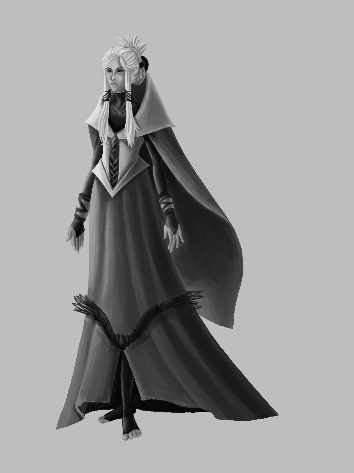
It's for a Zodiac Concept Art competition. One of my friends decided to go for Gemini, another for Pisces, another for Aries, and I decided to go for Virgo.

Aaaaaand naturally, we did the concept design process for them, following the guild-lines from the contest; it was a basic version of saying that it needs to represent the sign and the concept that we are doing has to be either character or creature, that the symbolism has to be there, the character represents the sign itself...

The sketches were a bit difficult, seeing as how I wanted to show the Virgo character as a leader who is an introvert, calm, analytic, and cool-headed while trying to present the maiden image.

The next being that I began rendering the character who I thought represented the Virgo most. It took a lot of critiques to make everything look right; and I had to change the dress a couple of times.


And finally came to the colors.

Virgo is an earth sign. And while the earth colors are associated with yellows, browns, and greens, Virgo's colors are associated with blues, yellows, and whites (don't know why; this is astrology). These were the first sets of colors:


...and then here was the final version. Aside bumping up the contrast with the shading and lighting, I also changed her dress color to green. Here is the final version:


I am actually proud of this one. Whew!

Friday, April 26, 2013

This...

A while back ago, I did a scene about a group of people being attacked by a snow beast. But, to be quite fair, the way I colored it was horrendous (college all-nighters does wonders to you that you should never experience). So, I decided to redo the coloring for it.

The result? I actually like it! (...finally.)


Thursday, April 25, 2013

Background practice!

So I've been doing a few practices on backgrounds and environment (along with props). ...yes, I did use an image reference for this one and most of the times. Perhaps I should do a outside door scenery next. For now, this is what I have so far:

At least it took me a while to finally figure out the painting portion of it (for some reason, coloring line art like this comes simple for me).


Tuesday, April 16, 2013

More Graphic Design jobs... and this.

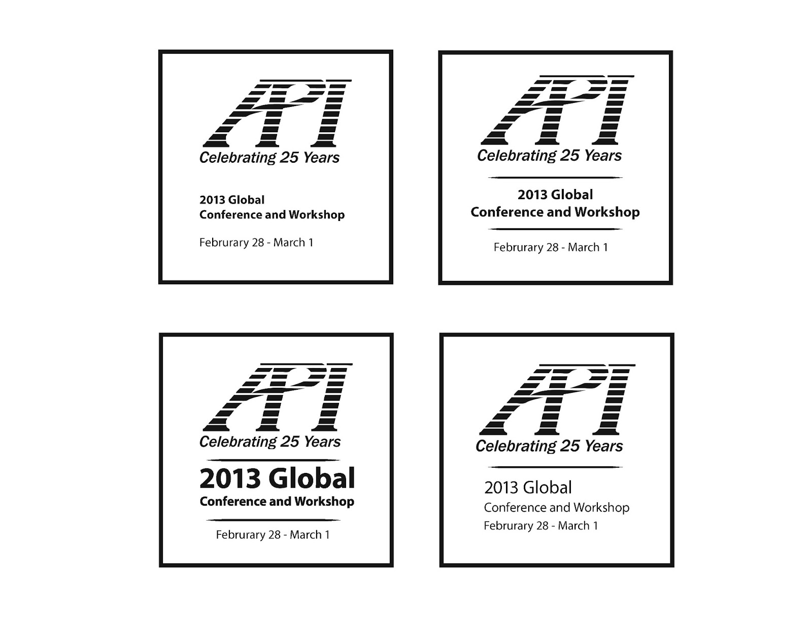
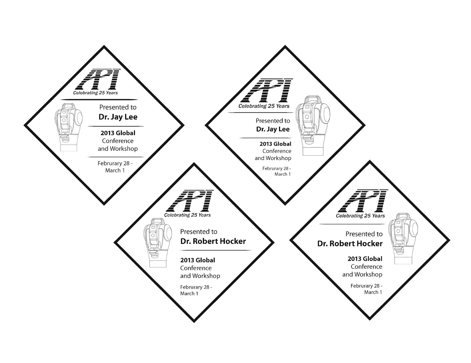
I was requested this a while back (around the winter) for a commission. The first one was for keynote awards - this one had a lot of details in terms of lettering along with the design along with legibility. I am not going to reveal which were the final designs.

General Awards
Keynote Speaker Awards


The second commission was for invitation borders. That was fun (it really was; I am not going to lie).

Thumbnails

Invitation
Menu

And I was messing around in Photoshop over the watercolor brushes I found on http://cghub.com/.


And that being said, I want critiques for these backgrounds; I am hoping to get better with these!


Wednesday, February 13, 2013

New Thoughts and Graphics Design

It's been a while, hasn't it?

I've been busy with a lot of events and there's been a lot of thinking on my mind since I've last updated. Some of them involving where my career direction would go, about where to find a job, how to get one... my situation is complicated and I honestly do not want to discuss about it. I have other people aiding me, I have been looking all over for jobs, I have been busy...

I'm making up excuses, I know. But I did not stop drawing; I did not stop giving up for trying to find a way to continue my art career.

I do plan to continue drawing and improving on my work; at the same time, I haven't been looking at this blog much since I post on Tumblr for sketching and practices (it's mostly fanart, what the hell am I talking about?).

One thing I plan on doing is to improve on my artwork, especially on redesigning most works I have done when I was a student. I know I have given it all back then. Now I want to improve on my paintings and try again to make sure they actually look better than before.

I have done various graphic design works; some of them I don't want to post up yet until the events happened. I have done some graphic design works in high school; I still work on them today, odd enough.

This one was actually for a karate school logo design; the client wanted a revamp of their logo for their T-Shirt (a black one). Instead of a tiger, they wanted a dragon while retaining the color scheme for the background and style of drawing. This was the first actual graphic design job I took; I am actually happy from the way this turned out!

All of these were done with Adobe Illustrator CS4.

Black and White version

Final version - colored